Lesson 7: Data analysis with python
The power of Python partially lies in the many library it offers. For this lesson and as a general paractice for data analysis with python, go ahead and perform these imports:
#imports
import numpy as np
import pandas as pd
import scipy.stats as ss
from scipy.stats import norm
import matplotlib.pyplot as plt
import seaborn as sns
import statsmodels.api as sm
We have used lists in Python, but instead of using those built-in structures it is more common a practice to use arrays from the numpy library (np.ndarray) and series from the pandas library (pandas.series or pandas.dataframe).
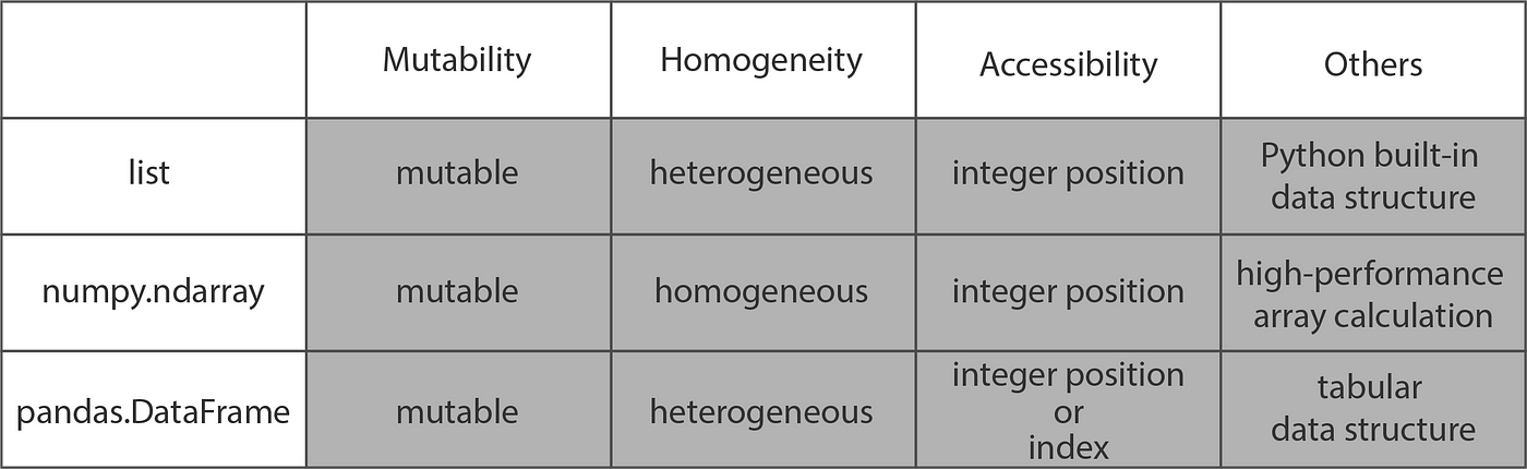
Table 1: (adapted from _Towards Data Science_) summarizes differences between the three data structures
As you can see form this table, it would make sense to use NumPy Arrays for calculations like taking average, sum, or even logarithm. Similarly, Pandas DataFrames allow tabular data access by ‘index’ or column headers and are hence ideal for reading and storing tabular data like excel files and CSV (comma-separated values) files. And the built-in list and tuple structures did give us flexibilty of having elements of differetn data types, which we lose in numpy and pandas array-like structures. All have their pros and cons, and are all useful in different scenarios. However, interestingly, they can all be transformed into each other by different functions as shown:
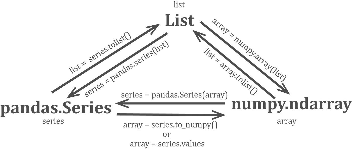
Fig 1: 3 formats inter-transform
1. Getting familiar with numpy arrays
Let’s start making numpy arrays
- Using an array-like structure input:
np.array([[2,3,4,5], (2,3,4,5)]) # note that it can take list and tuple
- Using a range of values:
np.arange(5)
(5 is stop value, check docs for start and step)
- Using random values:
    np.random.seed(3) # setting a random seed
    np.random.randn(12) # 12 random values (from a standardised normal distribution)
A numpy array x can be visualized as n-dimensional matrix with shape given by x.shape, total number of elements by x.size, transpose by x.T and number of dimensions (n) by x.ndim
Example:
x = np.array([[2,3,4,5], (2,3,4,5)])

print(x.size) #8
print("Before transpose, shape: ",x.shape) #(2,4)
y = x.T
print("After transpose, shape: ",y.shape) #(4,2)
Using np.sum(x) we get (you guessed it) sum of all values in x. But using axis pararmeter of same function, we can get array of sum of each column of x.
print(np.sum(x, axis =0)) # [ 4  6  8 10]
print(np.sum(x, axis =1)) # [ 14 14],       axis = 1 means sum the columns
# print(np.average(x, axis =1)) gives you average
Adding 2 Numpy arrays will give the result of additions element-by-element
a = np.array([1,2,3])
b = np.array([3,-1,0])
print(a+b)
Values can be accessed just like lists:
print(x[1,3]) # 5 (value in 1st row, 3rd column
print(x[1][3]) # same as above
print(x[:,1:3]) # [[3 4], [3 4]] (values in all rows, from columns of index 1 to 2
np has function that can be applied on all elements
print(np.arcsin(I))
a*b is element-by-element product of a and b np.dot(a,b) gives dot product of a and b
print(I*[[2,1],[1,5]])
print(np.dot( I, [[2,1],[1,5]] ))
You can concatenate or stack vectors vertically (np.vstack()) or horizontally (np.hstack())
a = np.arange(5)
b = np.vstack([a, [9,2,0,9,3] ])
print(a)
print(b)
We can also perform element-wise operations on arrays of higher dimensions using that of lesser dimensions or even scalars. The effect of the operation simply gets applied throughout the ‘extra dimension’. This is called broadcasting.
print("a+3:",a + 3) # adds 3 (scalar) to all elements of a
print("b + 100: \n",b + 100) # adds 100 (scalar) to all elements of b
print("b * [[3],[100]]: \n",b * [[3],[100]]) # all values in first row get multiplied by 3, 2nd row by 100
Numpy arrays are great for all sorts of calculation-based analysis and will be used frequently.
2. Using pandas
Pandas is a friendly way to read, analyze, and write numerical datasets of a variety of formats. We will use CSV (Comma-separated Values) which uses a comma as a delimiter. We explore two examples - a small dataset, and a large dataset
2.1 Small Dataset example: Ladder Distances (Read, Plot, Regress, Write)
In gel electrophoresis, a DNA band travels farther if it has greater number of base pairs. We have data for band distances (cm)
There is a non-linear direct relationship between band distances and length of fragments, but the constant depends on the gel properties. We use a standard library of known fragment sizes that appears like ‘ladder’ and measure the distances from the wells of the ‘rungs’ or the bands. In Fig 2, the ladder is λHindIII. Then by measuring distance from the well for our samples (A(1,2,3),B(1,2,3)), we can determine the corresponding length of DNA fragments.
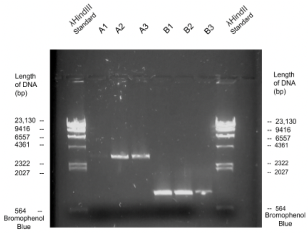
Fig 2: shows the image of Ishaan's gel under high frequency light
Let’s get Ishaan’s BIMM 101 (Recombinant DNA lab) ladder distance readings:
wget --no-check-certificate 'https://docs.google.com/uc?export=download&id=1QDnwIniSqER03VxS5jGNdBLq4dZ1t66o' -O ladder_distances.csv
head ladder_distances.csv
Now let’s form a pandas.DataFrame object ‘ladder_dist’ containing this data
ladder_dist = pd.read_csv("./ladder_distances.csv")
"""Data types"""
# print(ladder_dist.dtypes)
"""Object type :"""
print(type(ladder_dist))
Notice that pandas assigned the int and float types automatically. Pretty cool, huh?
Let’s first get the column names using ladder_dist.columns
Where did these column headers come from??
- The columns headers are the first line of our file
- This is not an absolute requirements for all csv files
- Check documentation for pd.read_csv() and check parameter ‘header’
Now let’s use column names as inidces to get particular columns
bp = ladder_dist["bp"]
dist = ladder_dist["distance"]
Use ladder_dist.index to get/set row indices
# Get row indices (currently range of numbers 0 - 7)
print(ladder_dist.index)
# Row indices can also be set
ladder_dist.index = ["first","second","third","fourth","fifth","sixth","seventh","eighth"]
ladder_dist
Access columns/ rows/ sections from data
# Get a row based on label
ladder_dist.loc["second"]
# TODO: check type (HINT: it's Series)

# Get a row based on int index
ladder_dist.iloc[0]
# TODO: Use iloc to get the first 3 rows (notice now DF is returned)

# Get a column by label as Series
# ladder_dist["bp"]
# or
ladder_dist.bp

# Get a column by label as Dataframe
ladder_dist[["bp"]] # (looks lit to me)

# Get a column by int index
ladder_dist[ladder_dist.columns[0]]
ladder_dist[[ladder_dist.columns[0]]]
Now feel free to read pandas documentation and get particular cells:
#Get particular cell
# By label
# TODO: Get the distance of the fifth gel band using ladder_dist.at

# By int index
# TODO: Get the same using ladder_dist.iat
2.1.2 Visualize the data
Let us visualize some data. Read matlabplotlib.pyplot documentation, and get a dot plot of ‘bp’ versus ‘dist’. (What should be on the x-axis?)
Does this look like a straight line to you? How about the log of this line? Now dot plot log(bp) versus distance. And kidly do this in the same python file or same ipython notebook cell.
You might realize that to plot them separately, you need something. And that something is plt.show(). It plots all open figures above it.
Also note there might be multiple functions in pyplot to achieve the same task.
Another way to visually represent the linear relationship between log(bp) and dist is to draw semi-log standard curve: i.e graph bp-dist, but set the x-axis log-scale.
# Log-scale plot
plt.xscale('log') # or plt.gca().set_xscale("log")
# TODO: now plot bp versus dist
2.1.3 Bring in Statistics
How strongly are log(bp) and diatnce related? Or should we ask,
How strongly are log(bp) and diatnce correlated?
There are different types of correlation coefficients for simliar purposes. Two of them are
- Spearman Rank Correlation Coeffiecient: Describes monotonicity
- Pearson Correlation Coeffiecient: Describes linear relationship
Which correlation method do you think is more appropriate for the relationship between bp and distance?
Which correlation method do you think is more appropriate for the relationship between bp and distance?
Let’s answer these questions by using scipy.stats (imoprted as ss) functions to actually get both pearson R coefficient and p-value and Spearman R coefficient and p-value for
- bp versus distance
- log(bp) versus distance
Using the r and p-values,can you now answer the more appropriate method questions better?
While we had observed a strong linear relationship between log(bp) and dist from the dot plot, we now have a statistical measure backing it up.
What we can now do is
- derive the equation of that best-fit line
- Use that equation to get bp in our samples for known distances
So let’s first get thhat line of best-fit. This is a type of machine learningn called Linear Regression and thus we start our machine learning component.
For machine learning, one of the most popular python packages is sklearn.
No clue how that works or even means??
Look at Fig 3 graph. We are given the blue data points, we are trying to predict that orange line that best fits the data. Equation of an ideal straight line is of y = mx + c form. Given multiple pairs x and y (the blue data points), we find the parameters m and c that give straight (orange) line y_est = mx+c where y_est closely estimates y values. A demonstration would perhaps explain even better.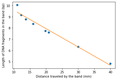
Fig 3: Expected output of Linear regression analysis
So let’s start machine learning!
Since we’re performing linear regression, we build a linear regression model object linregressor using linear_model.LinearRegression() from linear_model that we already imported from sklearn.
Now sklearn.linear_model.LinearRegression() models take parameter X and Y, where X is the array containing each data point’s ‘feature vector’ (a vector containing features that describe the input part of the data point). In our case, the feature vector for each of the eight points contains just one feature - the dist if that data point. So we just need to transpose dist, a row vector, and use the column vector as X, and similarily use the transpose of bp as Y.
We know that transpose of np.array a is a.T (Hurray!)
However, for 1-dimensional numpy array a, a.T returns the same row vector a, so it’s not that straightforward. (boo!)
One simple way to get our Y and X is to:
distX = [[x] for x in dist]
log_bp = [[y] for y in np.log(bp)]
distX,log_bp
You are really getting the hang of it if you came up with that, but also numpy has a special function to convert 1-D to 2-D np.atleast_2d(). (Hurray!)
So to get the transpose of a, just use np.atleast_2d(a).T.
# feel free to try taking transpose a 2-dimensional vector
a = np.arange(5)
print(a)
print(np.atleast_2d(a))
print(np.atleast_2d(a).T)
Now that we have column vectors distX and log_bp, lets fit the model with linregressor.fit(distX,log_bp) # fit([x values],[y values])
Now we can get the parameters m and c using linregressor.coef_ and linregressor.intercept_ respectively. Can we use these parameters to get our best-fit line?
Plot the best-fit line continous (not dot) for our x (dist) values with the actual (x,y) (i.e (dist,bp)) data points as dots. Use the code given below.
plt.plot(dist,bp,'o')
plt.plot(distX, np.exp(linregressor.coef_*distX + linregressor.intercept_,))
# or to get the line starting from x = 0
# plt.plot( np.hstack([[0],dist]), np.exp(linregressor.coef_*np.hstack([[0],dist]) + linregressor.intercept_)[0] )
plt.yscale('log')
plt.xlabel("Distance traveled by the band (mm)")
plt.ylabel("Length of DNA fragments in the band (bp)")
You should be getting a graph like Fig 3.
This line of best-fit lets us predict the lengths of fragments for sample A (dist = 18 mm) and B (dist = 26.16 mm).
Besides getting linregressor.coef_*dist_A + linregressor.intercept_ to get the log(bp_A), we can also use linregressor.predict(dist_A).
print(np.exp(linregressor.coef_*[18,26.16] + linregressor.intercept_))
print(np.exp(linregressor.predict( [[18],[26.16]] )))
Ishaan’s hand-drawn semi-log curve gave the answers 3900 bp and 1000 bp. Do your answers seem consistent? Feel free to use the plot to convince yourself.
So shall we move to move to the large dataset? This dataset is from a historical paper “Molecular classification of cancer: class discovery and class prediction by gene expression monitoring” and we will use that for our classification workshop in the next lesson :)